Zero Issue
Comic & Collectable Mobile App and Website
“Millions of transactions, Zero Issue.”
What is Zero Issue?
Zero Issue is a mobile application that offers eCommerce and social interaction. They partner with many different comic publishers and offer a huge catalog of new comics. The brand is made for the community by the community. We want people to get out and meet each other, get involved in local events, and make new friends!
Our application, while primarily geared towards comic books, offers users the ability to trade with a huge variety of different products, series, fandoms, etc. There’s a little bit for everyone when it comes to Zero Issue. We are building one unified community for the whole collecting world. This would allow for a one-stop-shop for all your collecting needs without having to search through multiple social media platforms to find what you're looking for.
Deliverables:
Primary Logo
Social media feed
Friends
Comic subscription
Back Issues
User Profiles
Messaging
Subscription calendar
Tools:
Adobe Illustrator
Adobe XD
Take A Closer Look
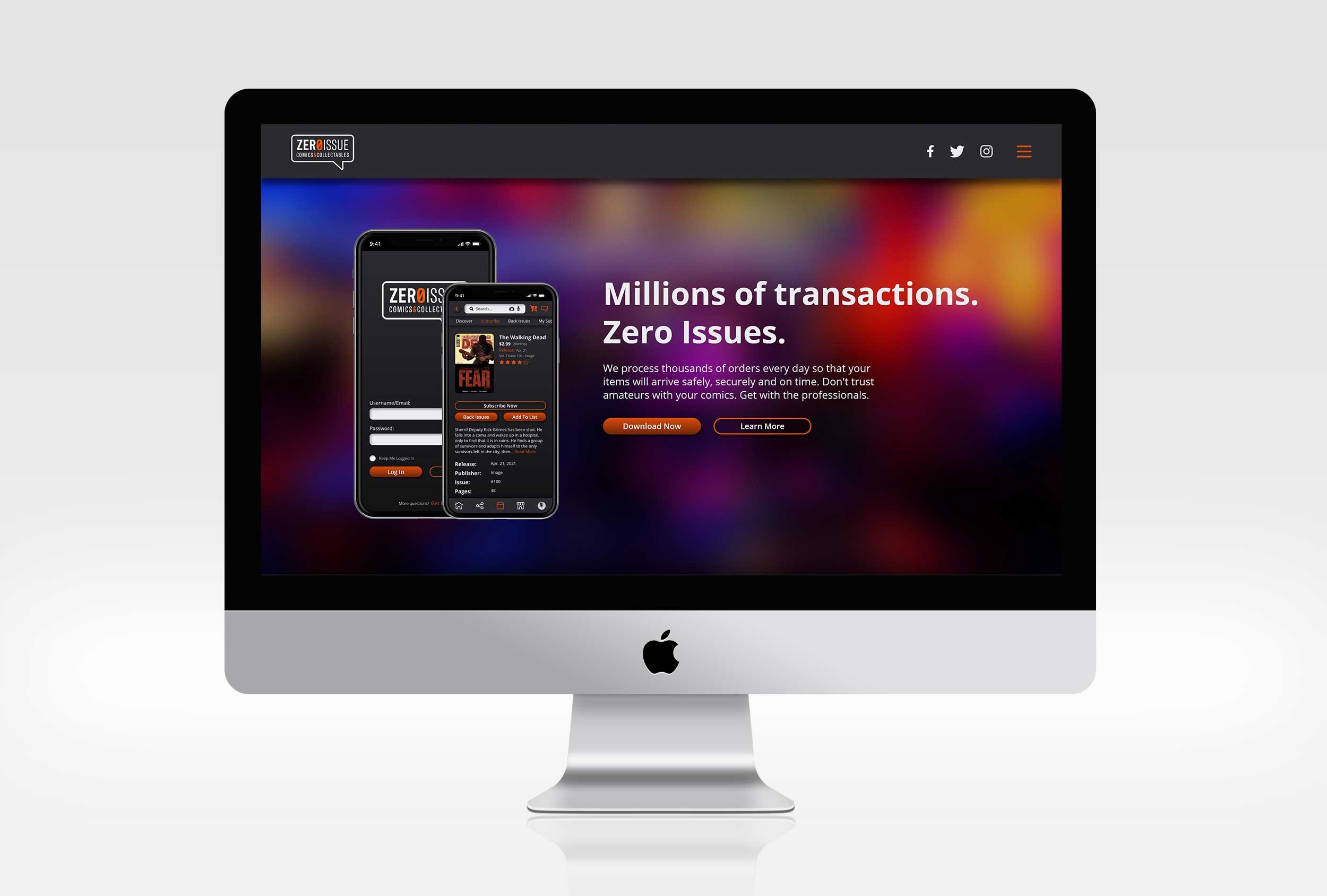
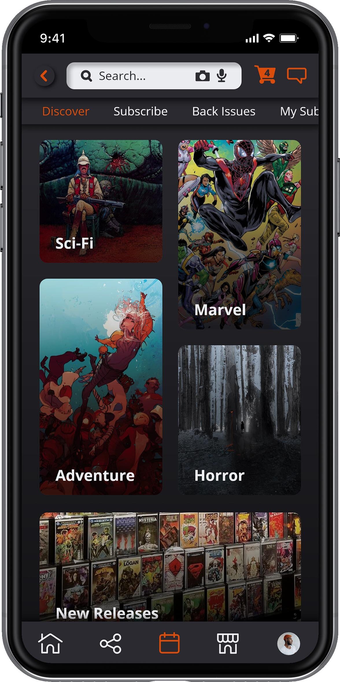
Click here to view the Zero Issue landing page. This webpage is designed to provide customers with information about Zero Issue and to direct them to download the mobile app. Click here to view the whole app. Scroll through your newsfeed, browse user listings, subscribe to new comics, and much, much more! Please feel free to click around as many of the features of this app are prototyped for interactivity.
Please note:
These projects were designed and prototyped in Adobe XD. Some problems may occur with animations when viewing the website version of these files (like some oddly placed scroll bars, not so smooth transitions, etc.) This is due to some limitations in the current Adobe XD software. Please keep this in mind when viewing these projects. Thanks!

Moodboard & Inspiration
Modern Comic Art
Modern comic art is often more refined and precise than it used to be. Comic art now comes in many different forms and styles. Many comics use bright colors to contrast dark backgrounds and now often use black borders to separate panels. They often deal with more serious and gritty themes compared to the early days of comics. As you can also see here there are many many different kinds of comic art styles. From watercolor to pencil sketches to 3D rendered digital artwork. Every comic is competing for the most attractive comic on the shelf. This means that my design must be adaptable and synergize well with many different art styles, colors, and themes.


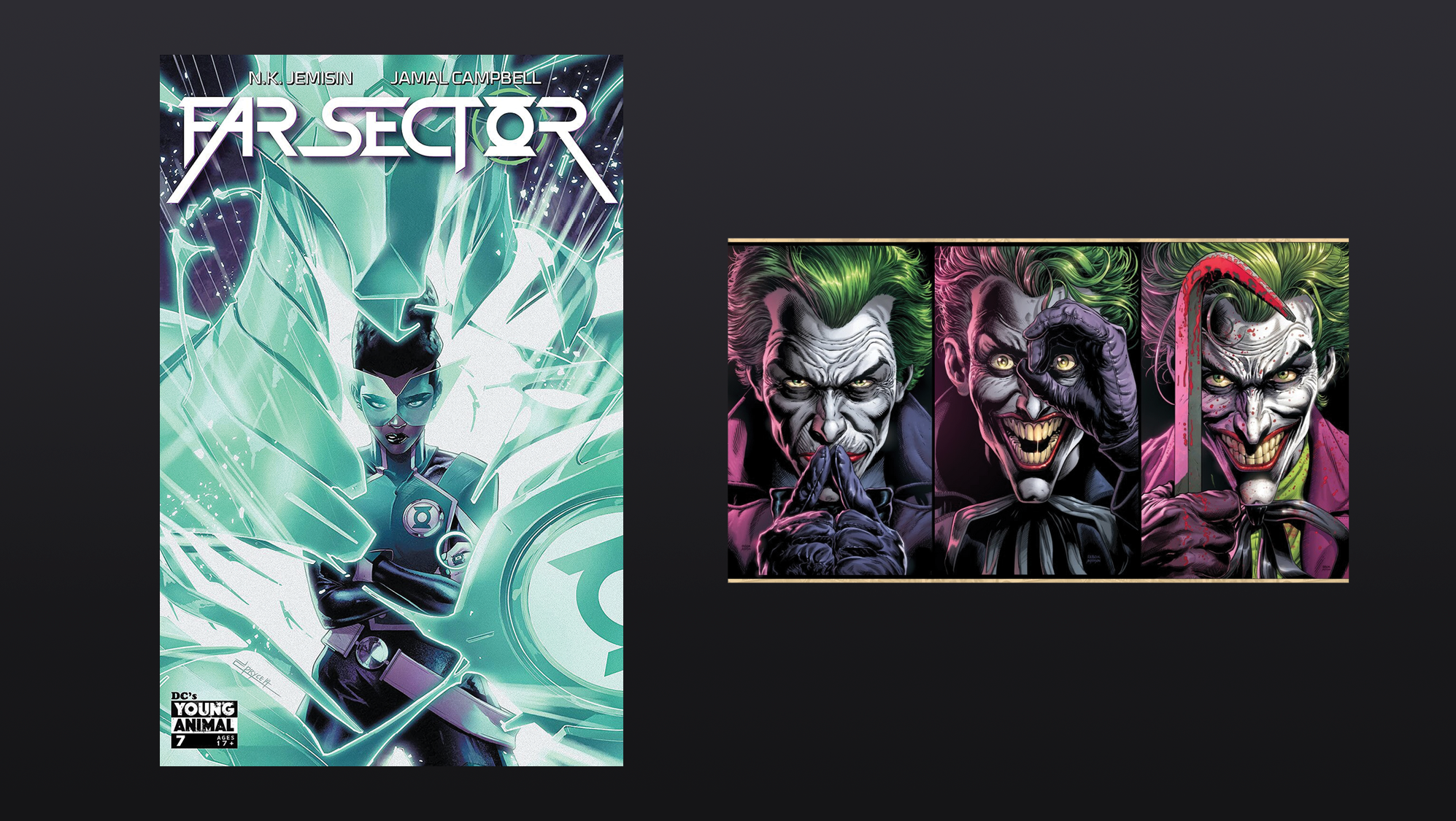
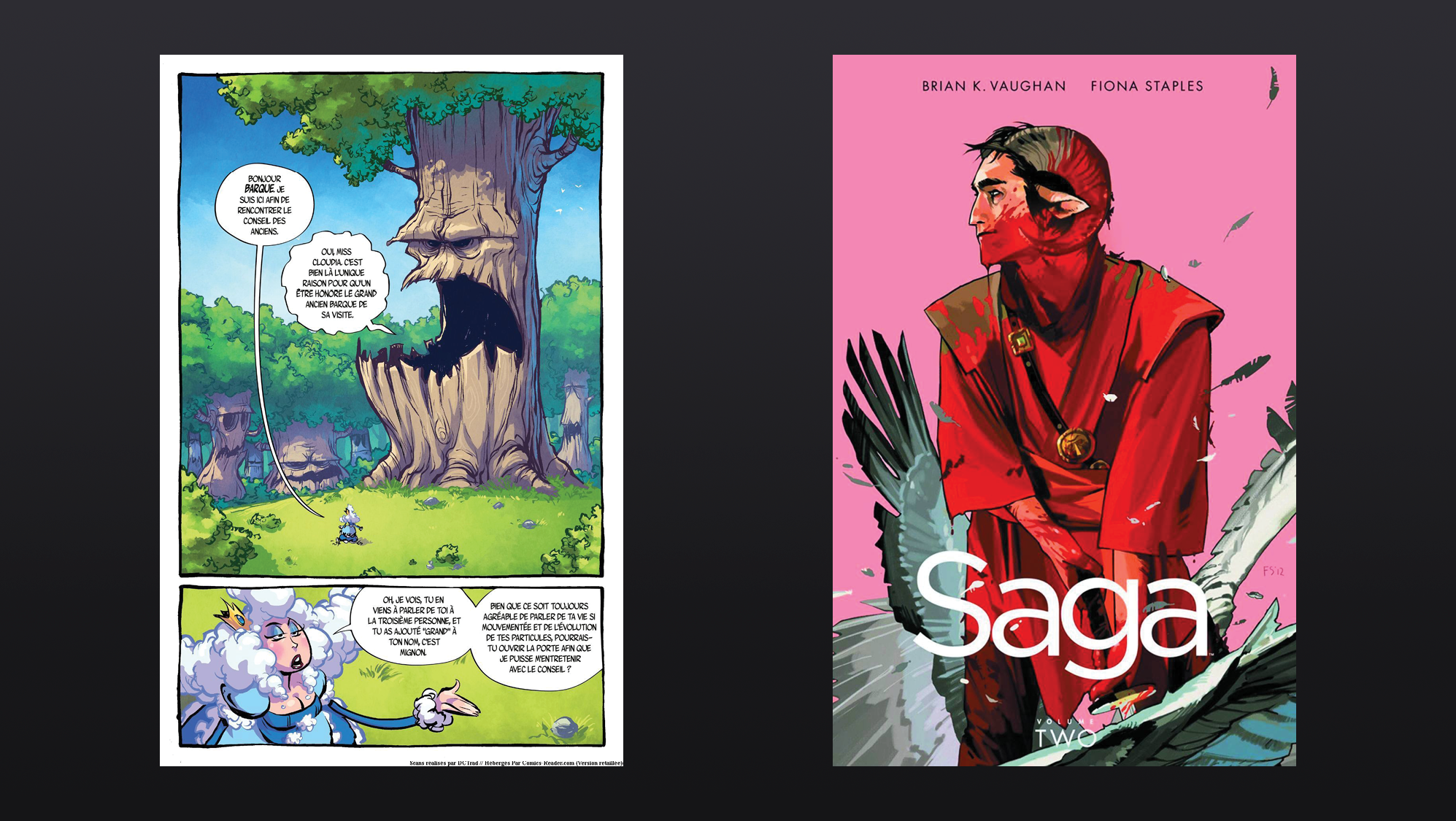

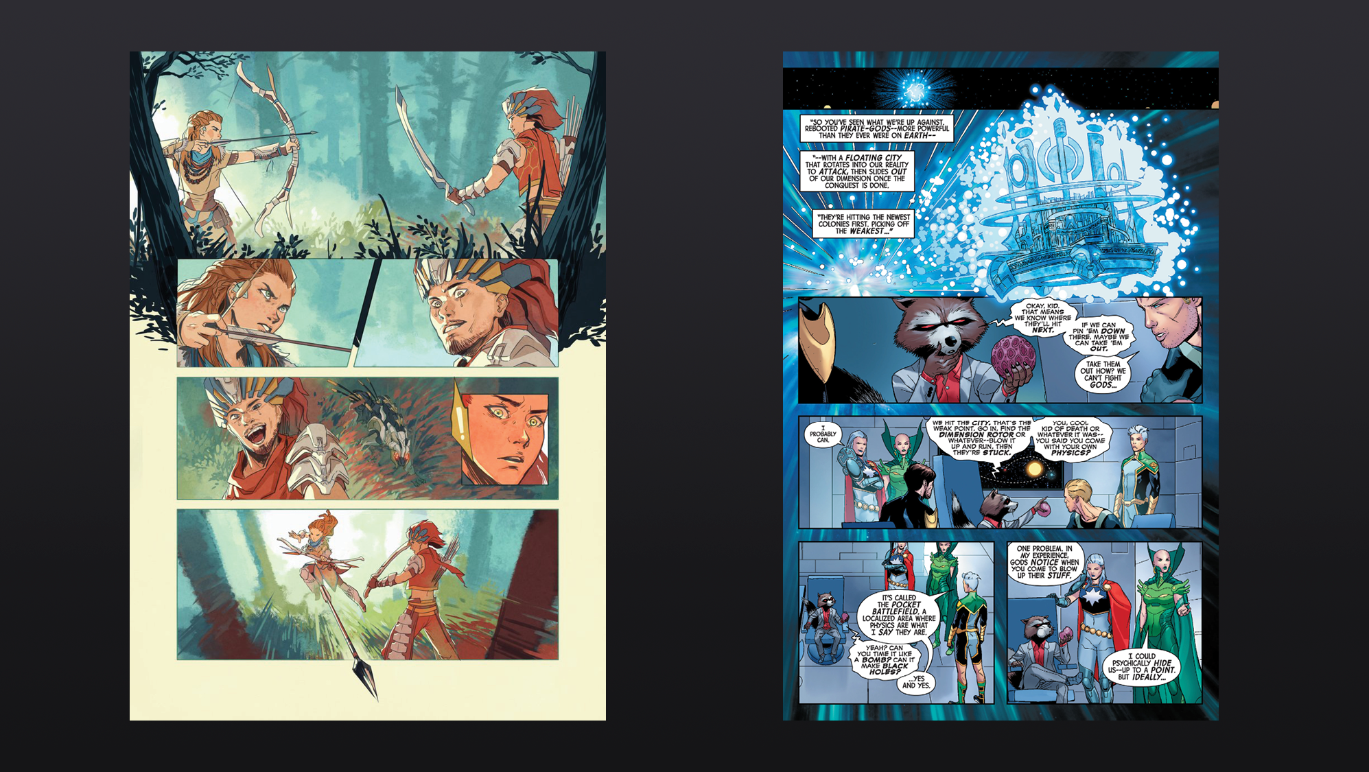
The Brand
Target Audience
The primary users who would be using this app are young adults. In the early days of comics, they were often marketed for kids and included limited violence. The themes, tones, and portrayals of violence have all evolved over the years. Now comics are mainly geared towards young adults and sometimes fully mature audiences. This age group is generally more attuned to social media as well which makes them our primary users.
Deliverables
1. Primary Logo
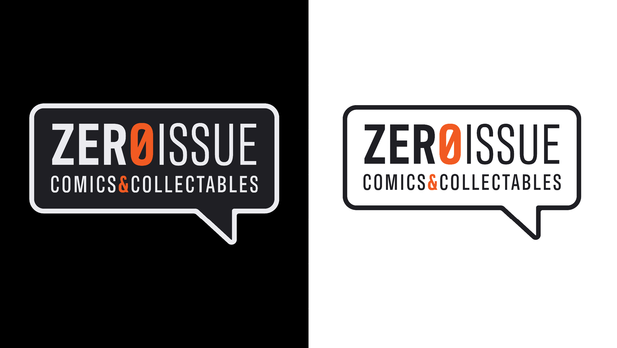
Black on White & White on Black
2. Fully Prototyped app with the following:
Social media feed
Friends
Comic subscription
Back Issues
User Profiles
Messaging
Subscription calendar
3. Website landing page
Logo Process Work
Sketches
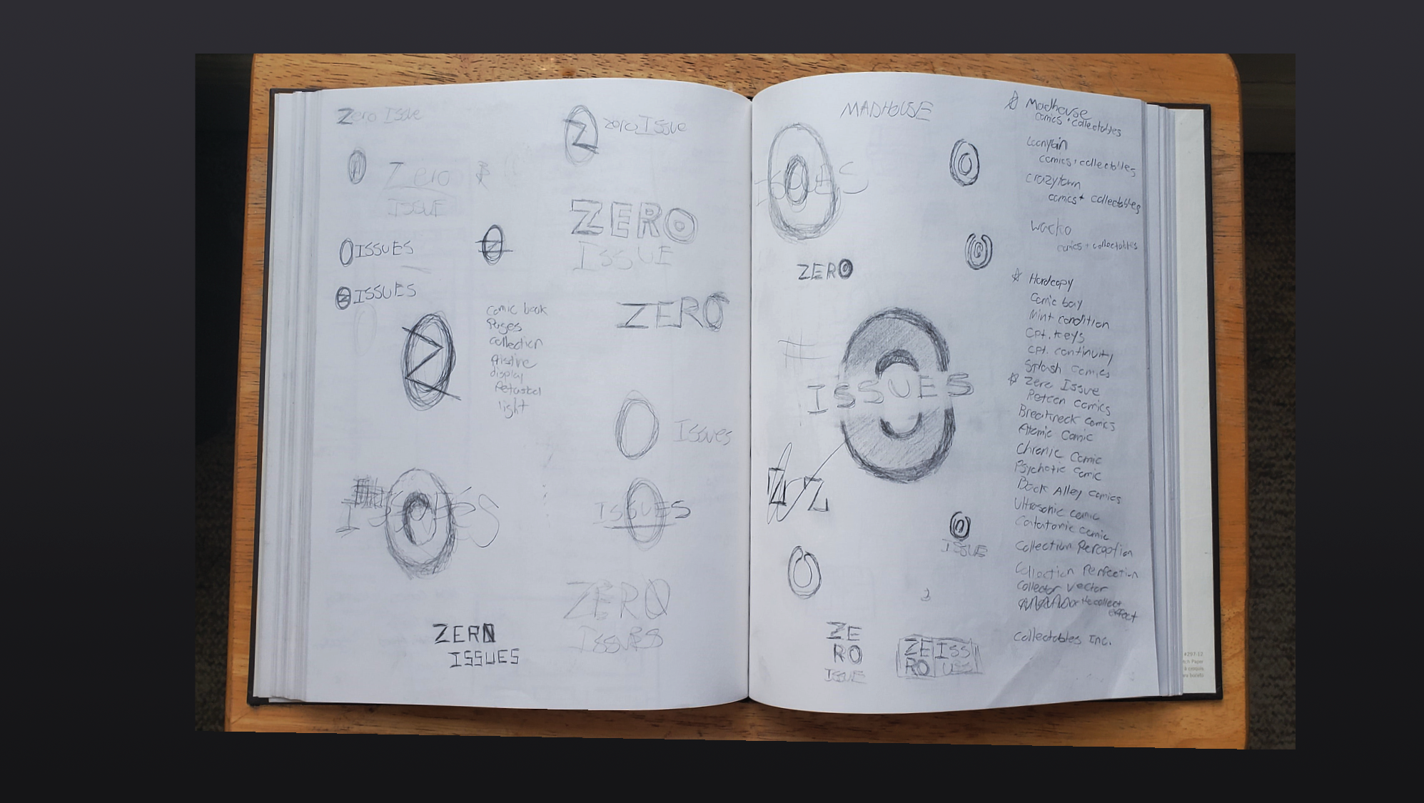
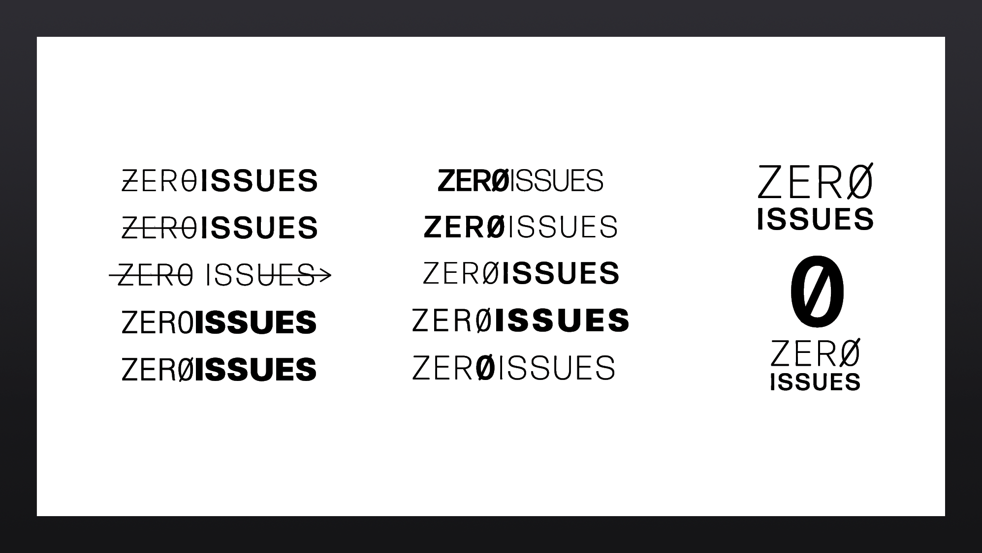
After all my research and experience I knew I wanted to design a brand that expresses modern comic book style. I wanted to use a contrasting color with a dark background. I also knew I wanted to relate back to comic-style lettering and artwork. First I started sketching out some ideas. I decided I liked the typographical approach because it gave me the opportunity to play with the number 0 and letter the O in Zero. I also wanted a logo that would mesh well and blend in with a variety of many different art styles and colors. I opted right away for san serif typefaces both because of their modern qualities but also because comic books use condensed san serif letters in their speech bubbles.
Going Digital
The beginning of my process involved research into neon lights and arcades. I was attempting a modern take on a 70s style arcade theme using very vibrant and bright colors against dark backgrounds. I didn’t like how the vibrant colors would clash with many other art styles used in comics. I did, however, like the direction the typography was going. I decided to keep the typographic direction and process further.

More Process
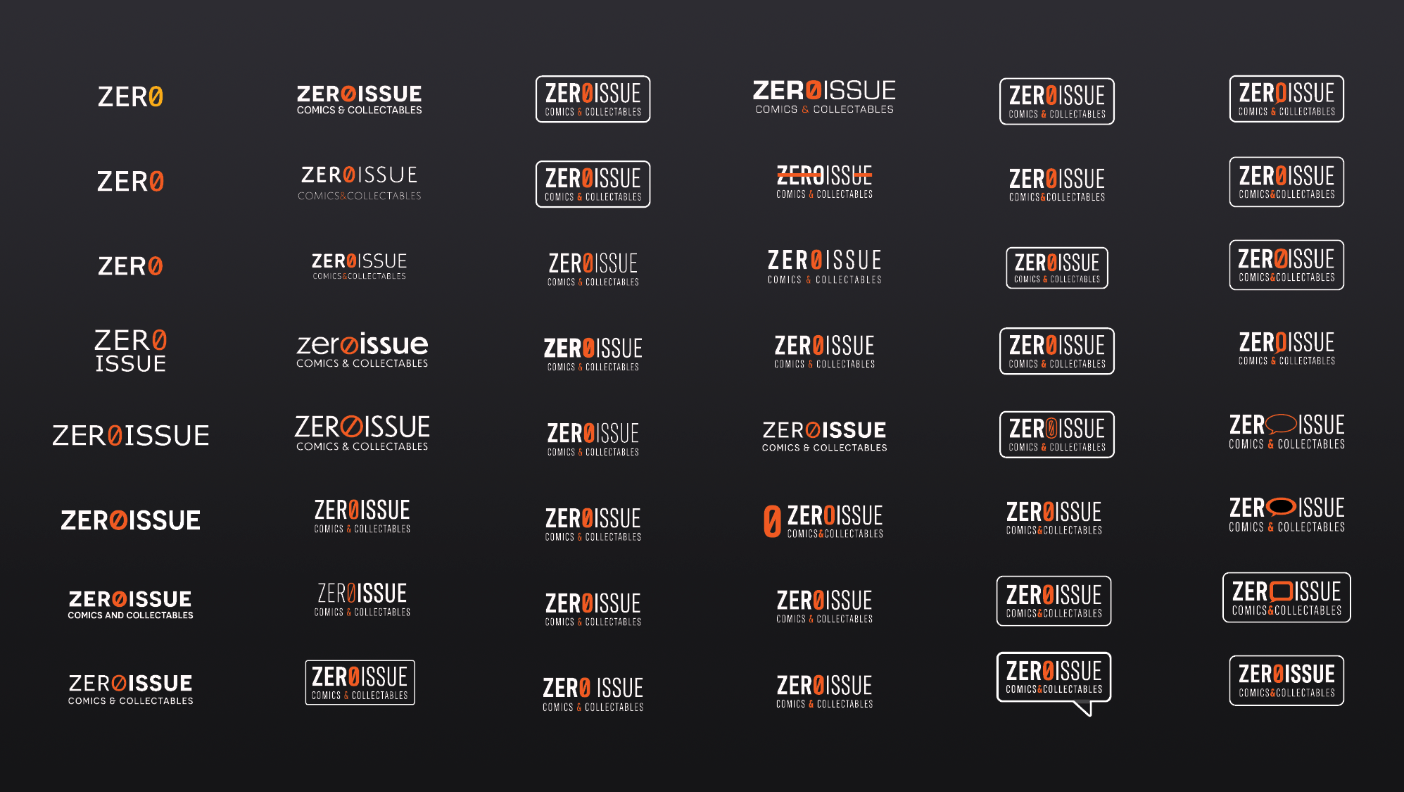
I started working with the contrast between words. I soon introduced the slash to the 0 which not only distinguishes the 0 from an O but also helps make the brand look more modern. Looking ahead to my other deliverables I knew I would eventually want to do my app in dark mode meaning I would be using primarily dark UI elements instead of white. In order to do this, I made the type into an off-white color. I wanted to draw more attention to the 0 so I created an orange that would complement both the off-white and a dark background. Off-white is also easier to read on a screen than pure white is.
Fine-tuning
From there I did a lot of fine-tuning and adjusting. I tried many typefaces and weights and started experimenting with adding a speech bubble element. I wanted to add these elements to make it more recognizable as a primarily comic-oriented application and also allude to the community-building aspect. I took inspiration from my previous neon sign direction and created a bubble that encapsulates the whole logo. I then finalized the logo by making this bubble into a speech bubble with a modern feel.
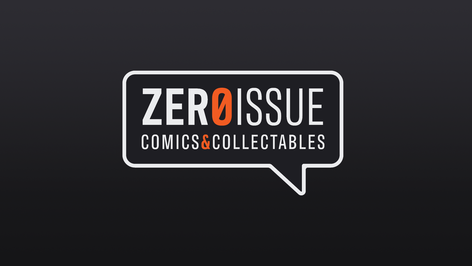
Final Logo
Our brand offers a modern feel that synergizes very well with comics from different eras and with different styles. This is very important because the application would offer both old and new comics as well as user-posted listings and news feeds.


Mobile App Process Work
Research
The first thing I did was download a bunch of different apps and try them out. I gathered resources from places like Instagram, Facebook, Mercari, multiple clothes selling apps, used car apps, letgo, and other mobile applications that offer social, market, and profile capabilities.

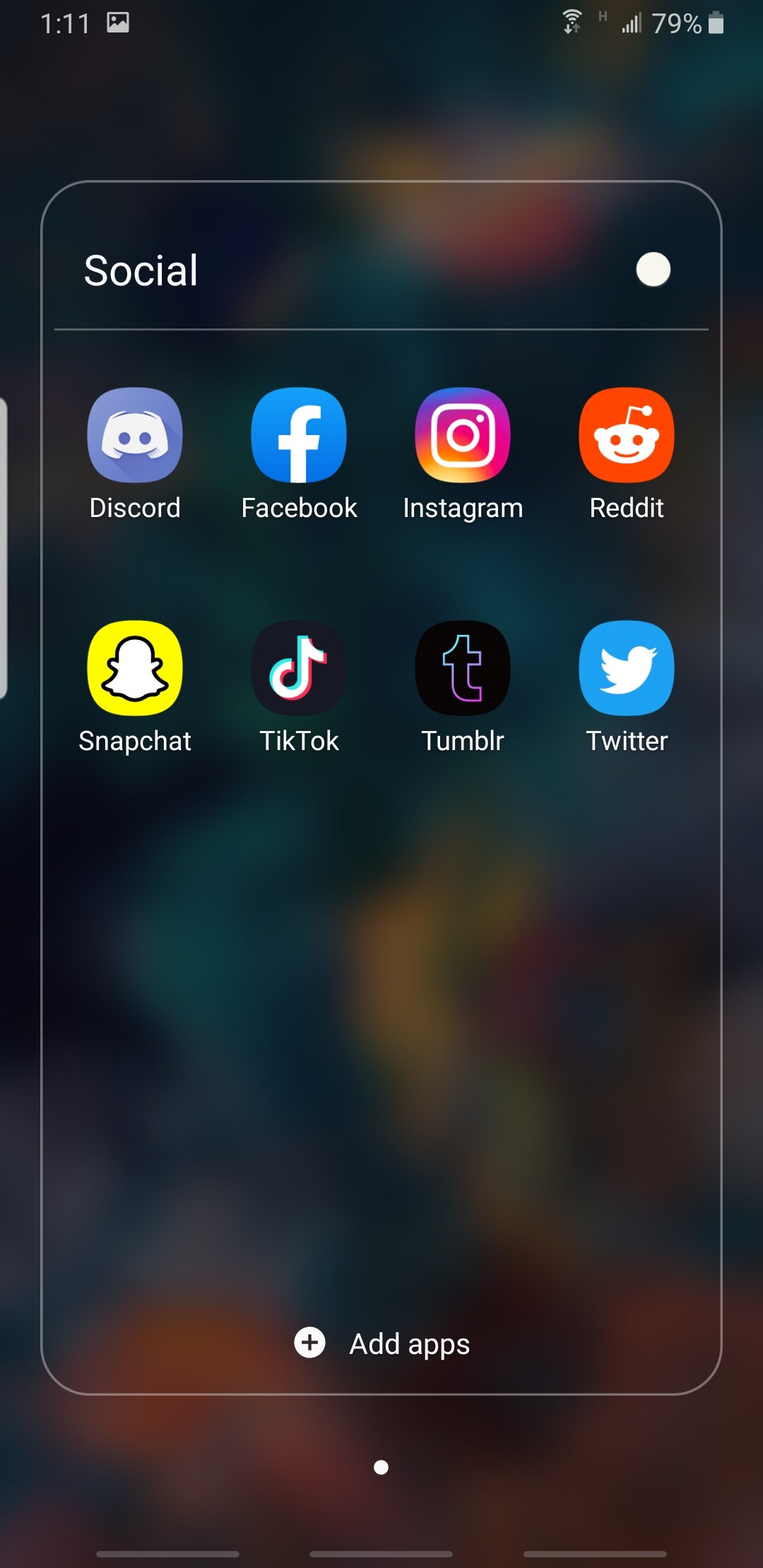
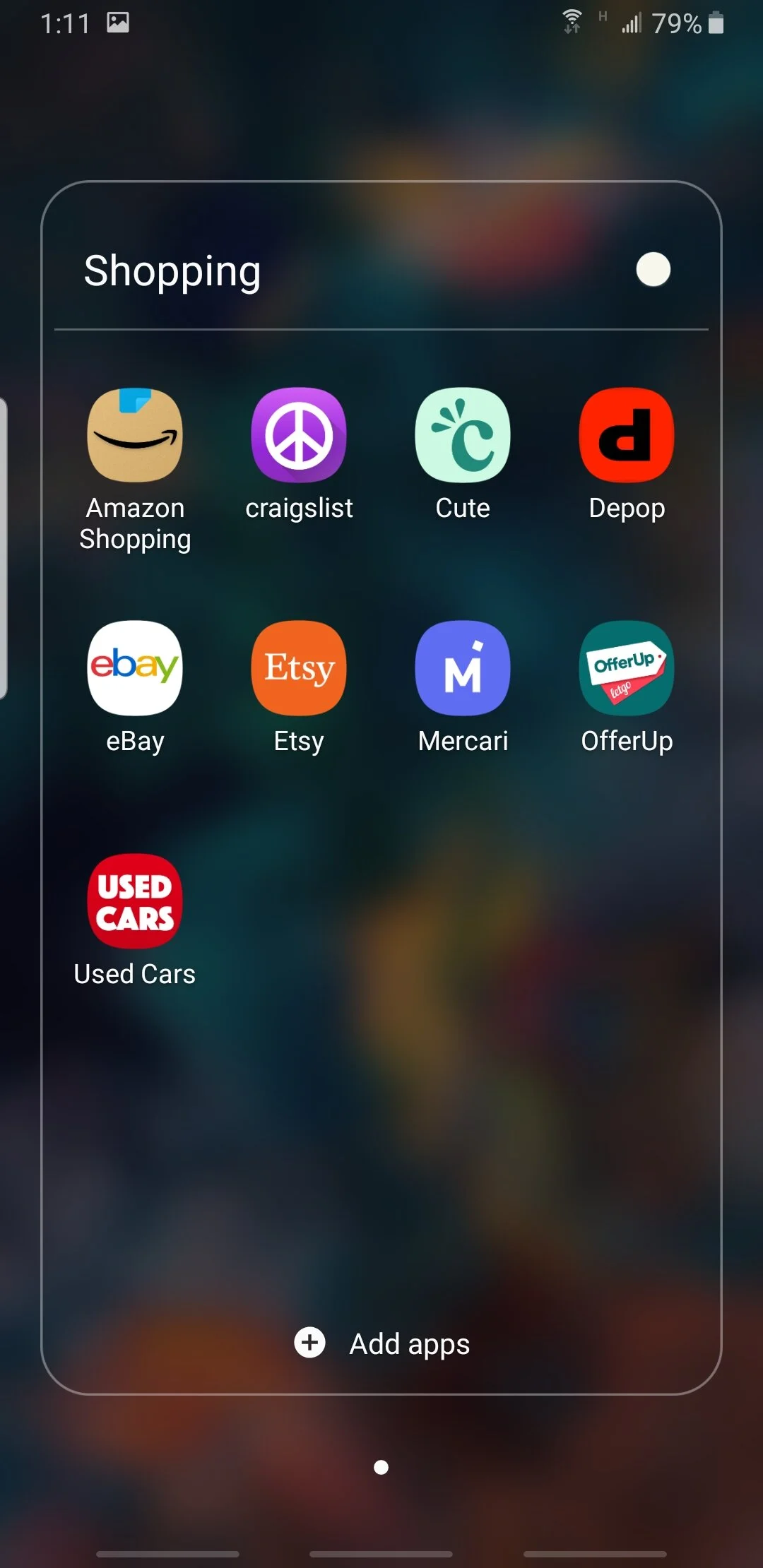
Screenshots
I took screenshots of everything I thought was important and organized them all into one file. I separated them based on category and compared and contrasted the different design elements, menu layouts, and UX/UI elements. This is a very important step considering there is no application quite like Zero Issue and that no other app combines so many different facets into one.
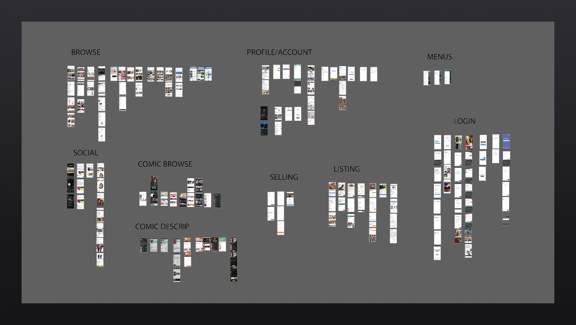
Categories
I made a list of all the different things I wanted my app to offer and separated them into different categories. This allowed me to start creating a loose wireframe to reference as I started the full design of the app. Some of these pages got condensed into other pages.
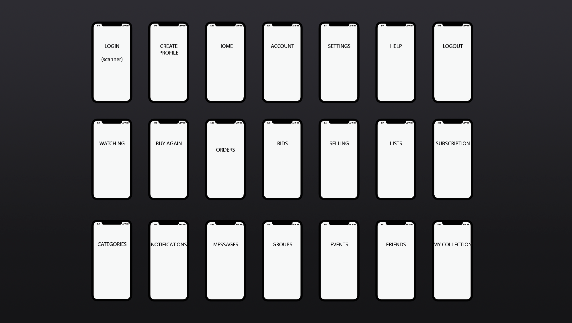
Wireframe
After I analyzed my findings I started creating a wireframe showing how I break up each section of the app and how they link to each other. This helped me as a basic road map during the early phases of development and allowed me to visualize how each part of the app would connect to the others.

Final Phone Application
And after a few different direction changes, a lot of fine-tuning, and a hell of a lot of prototyping, I finally arrived at a finished app. Click here to take a look at the final version!

Landing Page
Take A Look
Click here to take a look at the landing page website for Zero Issue. The landing page is supposed to be a minimalistic website whose purpose is to direct the user to download the mobile application. It also gives some additional information on what exactly Zero Issue is and stands for.
Please note:
These projects were designed and prototyped in Adobe XD. Some problems may occur with animations when viewing the website version of these files (like some oddly placed scroll bars, not so smooth transitions, etc.) This is due to some limitations in the current Adobe XD software. Please keep this in mind when viewing these projects. Thanks!
